Analysis and Visualization
SVAtlas provides a comprehensive workflow with three integrated tools for single-EV analysis, enabling automated processing of raw matrices into interactive visualizations without external software. Users can re-analyze SVAtlas datasets or upload their own data (format: symbol, EV, variable, value, group) to perform heterogeneity analysis and explore molecular profiles.
(1) An automated single-EV analysis pipeline processes expression matrices (SVAtlas or user-uploaded) for heterogeneity analysis, generating t-SNE plots of EV subclusters and JSON-format results. Standardized workflow is also available on GitHub: https://github.com/sduhoulab/EV_analysis .
(2) EVisualizer, an interactive visualization platform, explores selected EV subgroups or markers across samples using clustering results. Users can load the JSON file from the first tool or upload their own JSON file.
(3) A customizable differential analysis tool that generates volcano plots and tabulated results based on user-defined thresholds.
EV Data Analysis
The demo (.zip) file corresponding to the example effect displayed in the right panel is available here. It includes 149 sample data files (.csv), each containing five fields: ‘symbol’(sample name),‘EV’ (single-vesicle probe sequence), ‘variable’ (biomarker name), ‘value’ (count), and ‘group’ (disease/control).
It is also recommended to self-host this EV data analysis tool, which is developed in the R programming language using the Shiny framework. The open-source code is available in the GitHub repository (https://github.com/sduhoulab/EVDataAnalysis) and can be executed locally in RStudio by following the provided installation instructions.

EVisualizer
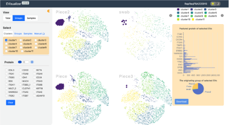
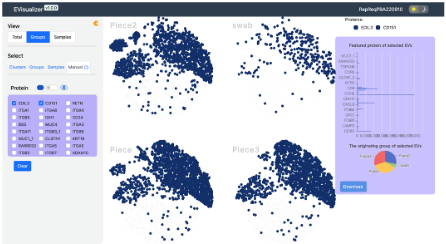
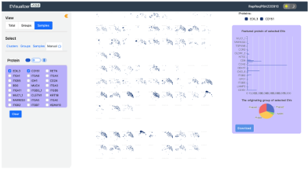
EVisualizer is a powerful online visualization tool dedicated to providing a comprehensive solution for visualizing generated single EV subpopulation data. Feel free to try the tool by uploading your clustered data file (.json format) and pressing enter. The program will automatically perform subgroup annotation. Users can also adjust parameters according to their needs, select total/group/sample for plotting, and choose markers for comparing expression abundance. In addition to image display, there are also data analysis functions to identify top markers for differential expression.
The platform supports direct import of JSON files generated by the first tool and users’ own clustering data files (in .json format). Detailed instructions are available in the “Help” section.
EVisualizer User Manual
Total View
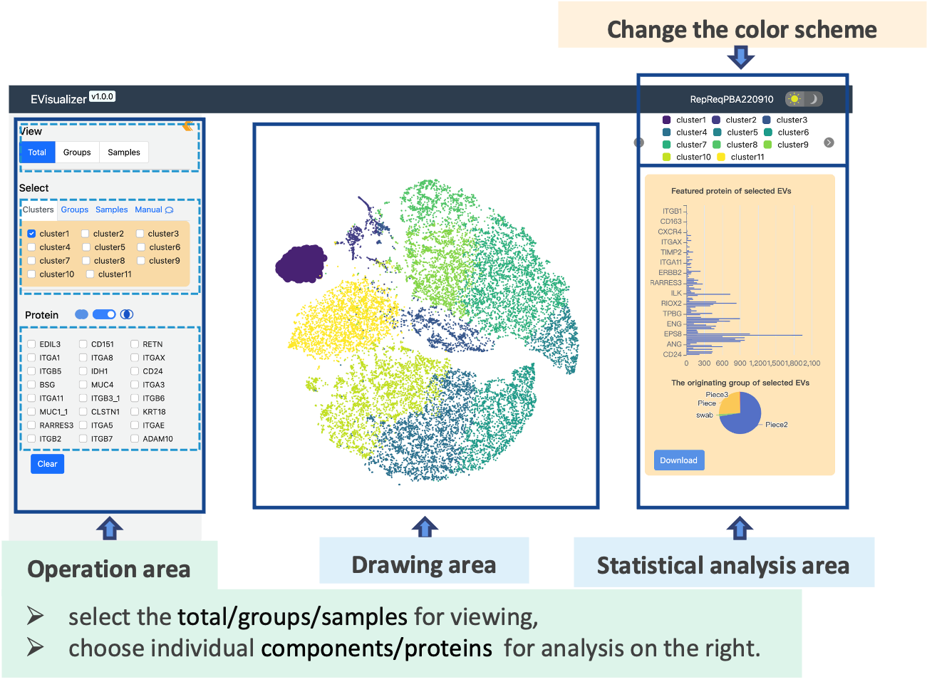
e.g. Groups-Cluster View
selected proteins view
e.g. Samples-Cluster View
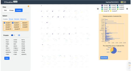
selected proteins view
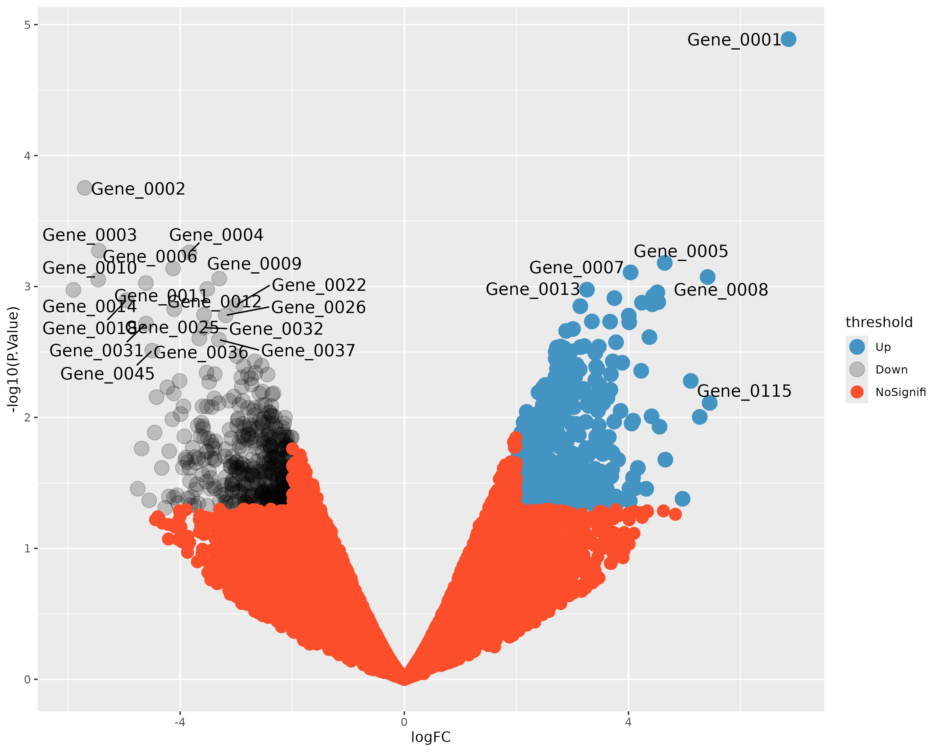
Differential analysis tool
The differential analysis tool integrates statistical significance and biological relevance (e.g., p-value) to intuitively display intergroup molecular changes. Users can input raw data, freely set groupings and logFC thresholds, and click the button to download differential expression analysis data and volcano plots.
Analysis
Please choose a file to demonstrate the Differential Expression Analysis.
The demo (.csv) file corresponds to the example effect (right panel) can be found here, which contains a control group (data columns are 1,2,3) and a disease group (data columns are 4,5,6)
Visualization